I came to this course in September with a basic knowledge of Photoshop from what I had learnt whilst doing my photography A-level. Over the course of the year I have learnt a lot from being around other photographers, looking at their work and seeing how they produced it. I have learnt that Photoshop doesn’t always have to be used to drastically change the entire appearance of a photograph or to correct a poorly taken photograph, even though it can be It can be used to subtly enhance and improve an image. The workshops we had in mm2 with Gary really only covered the technical stuff that I already knew, however, despite already knowing what each Photoshop tool did, I was previously unaware of how to most effectively use them and apply them to my work, which I was taught in the two lessons we had with James. I also learnt about shooting and editing in RAW format and all the benefits that come with that. He also taught me how to use the blending modes on each layer and a technique to ‘airbrush’ effectively.
This small section of my project demonstrates the subtleties of Photoshop and its capability of enhancing a photograph.
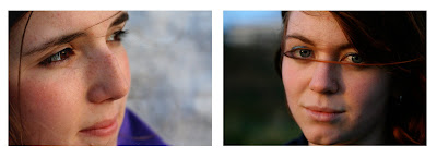
These two photographs were taken on a sunny evening just as the sun was sitting on a cliff top in Newquay, Cornwall. Both photographs hold happy connotations of the evening spent with my friends and the town were my family have holidayed for 10 years. Taken with a macro lens on my Canon 350D, both photographs have a strong depth of field with the focus lying mainly on the subjects’ eyes. The wind was quite strong and this can be seen in both photographs with the subjects’ hair across their faces. I think this adds needed detail to the images and is an important device in setting the scene of where and when the photographs were taken. The setting sun has created a warm glow on their faces and this, along with the subjects’ wistful expressions, creates a welcoming and relaxing feel the photographs. Using digital darkroom techniques such as a small amount of dodging and burning, using levels and curves and colours and saturation sliders, these digital images have been edited subtly just to enhance the photographs and not change them. I have chosen to present the photographs together even though I think they stand strongly alone, not only because they were taken of two of my good friends at the same time, but also because they are aesthetically similar, with the emphasise on the eyes, hair and expression and with similar crops and lighting.
The three photographs above are taken of a trainer, which is used later in the project. I have chosen to present the images together because separately the images could be considered to be weak. Each image shows a part of the trainer, seen as a part of a set, calling upon the viewer’s knowledge of trainers the series presents the trainer in its entirety but draws focus to the details of the trainer that might ordinarily be overlooked. Again these images have been subtly edited using non-invasive Photoshop techniques to enhance the photographs. Shot in raw, I used the raw converter to add a hint of blue using the temperature slider to pick out and emphasise the blue details in the trainer. I also enhanced the contrasts and the blacks. Once converted into a tiff file, I also applied a similar flash light lighting effect to each image to focus the viewer’s attention on the part of the trainer I wanted to show.
The following two images were taken specifically for an editing technique I have experimented with later in the project, however I felt they were useful here in demonstrating that more invasive yet still realistic Photoshop manipulation can be used to change the entire atmosphere of the photograph, even here with two very similar original photographs. I have chosen to present the two photographs together simply as I am comparing the two photographs and the techniques employed with both.
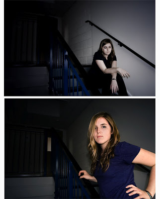
I will start with describing the darker of the two images, which despite its appearance has had less editing done to it than the other. The majority of the editing with this photograph took place when converting the raw file to a tiff. I de-saturated and lowered the ‘vibrance’ of the image, whilst heightening the contrasts, blacks and blue tint. I also added a small amount of noise and decreased the sharpness of the image in order to fade the focus on the model’s face. Once converted I then added a spot light lighting effect in order to darken the image and place the background into darkness. I also used the burn tool at different opacities to darken the light shinning through the door and the white panelling on the stairs. All these editing methods paired with the models pose and expression, help to create a sombre image with connotations of loneliness.
The next image that was taken seconds later and with the camera in the same position, was, when unedited, very similar. The model still has a blank expression but with a more assertive pose and direct eye contact with the camera. The sun light from the window behind the camera catches the subject’s hair brilliantly and emphasising this with the dodge tool instantly creates a warmer feel to the photograph. In order to retain this detail and the bright colours on the subject I duplicated the background, creating two identical layers. I then de-saturated the bottom layer to about -40% and began to rub out the top layer using the rubber tool set to approximately 40% opacity. I made sure to avoid the figure when erasing the top layer. This helped to dull the colours of the background, whilst still retaining some of the original warmth and depth that the coloured background provided. I chose to keep the light shinning through the door, although I did darken it slightly using the burn tool, and the same with the white panelling on the stairs. To the bottom layer I then applied the same lighting effect as the previous image. As this was applied to the layer under the figure, the figure was unaffected leaving the figure’s colours intact. This image feels much lighter and loses all the sombre tones and connotations of loneliness attached to the previous image, replacing them with strength, with an almost confrontational subject in the foreground that refuses to blend in with the background of the photograph.
Friday, 16 May 2008
Layering Images
Layering two or more images over each other is a quick and easy way of creating an entirely different-looking image. Quite often the effect can look amateur and sometimes confusing. The technique is often at its most effective when it is less detectable. For this section of my project I have experimented with this technique, using it in different ways to create very different images.
With my first experimentation with layering images I wanted to create an image that was made up of layers of photographs that all related to the same subject. I chose to do an image about my hometown Letchworth Garden City. Letchworth proudly boasts of being the first garden city, a place that supposedly has the best part of the countryside (the green of trees, grass and field) and the best part of the city (community and shops etc) mixed into one town. To convey this I used a photograph of grass that I sourced from the website http://www.graphicfields.com/textures.htm, a photograph that I took of a flower and a photograph that I took of the Letchworth sign. Using the grass photo as the base layer, I then layered the flower photo, I decided to mirror the flower photo and flip upside down as the flower in focus detracted from the Letchworth sign that I layered on top. I selected the Letchworth sign and deleted the remainder of that layer and then played around with opacities and layer blending modes until all components of the image were visible. Although achieving what I had set out to do with this image, I am not pleased with the final image (below), it is messy and distracting, the photographs used do not work together.
Learning from my previous experimentation with layering images that the photographs were too different to work together I went on to create this image. Using two images that were both taken at the same sunset (above). I layered the two images on top of each other, with the fence continuing off towards the distant horizon. This creates an ambiguous and confusing image, as the fence, with all its connotations of confinement, actually appears to lure the viewer towards the freedom of the open sea. Again, however, I am not very pleased with this image, although separately I like the photographs, together, they looks confusing and crowded.
Having discovered in the last two images that over laying two images with separate focal points, becomes confusing and crowded, with this image I experimented with using one strong image and over laying it with a more textured base image, in this case a macro photograph that I took of fire and the texture of the wood that was burning. Because fire is often associated with death and fear I choose to use one of the images I took for my studio module as the second layer. The photograph is a high key, close up of a girl with scary face paint on. The expanse of white on her right cheek is perfect for showing the texture of the wood in the layer behind and the subjects left eye is looking through the a flame at the viewer which also works well. In order to create this image I simple layered the two images on top of each other and changed the opacities of the two layers until I was happy with the image.
With this image I wanted to try conveying two very different and conflicting scenes together. The base image is in fact an HDR image I created of a sunset from out of my halls living room window for use later in the project. When creating the image I edited it in such a way that created a lot of black around the edges of the image, this hid the Leeds skyline and all the buildings that were originally visible. This allowed me to present the sunset as if it was in a country setting. I achieved this by selecting a windmill, from a photograph I took back home, using the magnetic lasso tool and then copying the windmill over into the sunset image in another layer. To the windmill, using the lightness slider in the hue saturation window, I darkened it completely in order to create a silhouette. I then added another layer that consisted of a photograph that I had taken of a brick wall; I lowered the opacity of the layer in order to reveal the layers below. The bricks were layered over the top of the image to ruin the country sunset and demonstrate the on-going debate over environmental issues – the paradox of a texture with inner-city connotations and the rural nature of the image’s other components appeals to our concern with the environment as human activity damages it. The addition of the bricks, however, resulted in the windmill being more obvious as the bricks layer was lighter and no longer allowed the base and top of the windmill to drift into darkness. This made the windmill look very fake and resulted in all three layers looking very separate. So having initially wanted the bricks to show the contrast between city and country I decided that the image is much stronger without the addition of the third layer.
I created this image purely to experiment with layering patterns into an image in order to create depth, texture and interest. The figure, building, tree and sky are all from the original image, which I used as the base layer. I then inserted two more layers, a blue coarse textured layer and a black and white pattern, that I applied soft light blend modes in order to reveal the base layer. I positioned the centre of the pattern over the figure’s head; this is to draw the viewer’s attention to the figure’s face and away from the distracting background of the tree and building. I then erased the part of the pattern layer that covered the figure’s face. I chose to retain the textured layer that lay over the figure’s face to stop the figure looking too apart from the rest of the image. I am not pleased with this image, although I like the angles used in the original photograph, the added layers add too much distraction and the subjects hair and figure is too over exposed.
Using what I had learnt from the last image, I tried to create a similar image with a sunny blue sky and textures, however, this time the focus lying on buildings instead of a model. Above are the original photographs of all the layers I used, the final image before I applied the textures and the textures used. I selected, copied and pasted each building on to the image of the sky, tree ad plane, and then used the free transform tool to position each building correctly onto the image. I flipped the red building in order for it to fit underneath the tree and draw the focus towards the plane that is now flying between the buildings. Once happy with the positions of the buildings I then added the two images you can see of blue textures as separate layers – the textured images I again sourced from the website mentioned previously. I applied a soft light blend mode to each layer and played with the opacity of each layer until I was happy with the final image.
The two original images, shown above, are both taken with my macro lens again, they both have vibrant colours and a close focus. I wanted to have the tongue going towards the sandwich as if to lick it. I first achieved this by trying a technique I learnt in one of the workshops. I layered the tongue image over the sandwich, and rubbed out the rest of the layer. I positioned the tongue where I wanted it using the free transform tool, and then, using different opacities, tried to blend in the tongue so it didn’t look as fake. The result was not very effective; it looks unsmooth and very fake.
Not being pleased with the final image, I redid the image this time using a different technique. I selected the tongue using a selection tool. I copied the selection over as a new layer and then free transformed the tongue into the right position, this time choosing to make the tongue slightly less wide. In order to blend the two layers together successfully, with the tongue layer selected I selected the perimeter of the tongue, I then applied a small Gaussian blur, this allowed the edge of the tongue to discreetly blur with the background image. I also applied small manipulation of colours and contrast to the sandwich layer to enhance the vibrancy of the image. The resulting image is vibrant, colourful and playful, with two strong focal points and a big depth of field, which a camera would be unable to capture.
Digital Hoaxes
With the next images I was experimenting with using Photoshop to exaggerate the original photographs or to portray them as something they are not.
When taking this photograph of my brother driving his motorbike I moved the camera in time with his bike in order to capture his figure and the bike in focus and show the movement by having the road and bushes blurred. Digitally I then enhanced this by selecting him on the bike as a separate layer. On the base layer I applied a movement blur and lined it with the direction of movement of the bike. I then applied a small black gradient to each side of the photo to draw focus towards the figure. I also enhanced the colours and saturation. In order for the bike not to look too unrealistic I selected the parameter of the bike and figure and used a Gaussian blue in order to get the layer to blend more easily and believably into the background.
This tutorial is from one of the photography magazines that I have been reading. In detail it tells you how to create a crop circle effect on a photo of a field. Instead of using the images provided to follow this tutorial I decided to use a photograph I had taken of a rapeseed field.
This is my final image, it took me about and hour and half to produce this and follow the complicated tutorial. I don’t think it works as well as the example because I chose to use a yellow field as opposed to dark green. This tutorial highlights the fact that hoaxing anything from aliens to perfect skin is becoming increasingly easy to do and increasingly hard to tell apart from the real thing.
This photograph is two stills from an advert from dove's campaign for real beauty. The film shows a sped up sequence of a woman being made up and then digitally enhanced. The final image is hugely different from how the woman originally looked. Here dove is trying to highlight what it sees to be a negative practice, which is all too prevalent in modern media.
This photograph of Kate Winslet has been heavily manipulated to make an ordinarily curvy Winslet look very skinny. On the release of this magazine Kate was outraged to see the finished result of the shoot that presented an untrue depiction of herself.The photograph on the far right is of Keira Knightly, before and after the image has been manipulated. In the final image Knightly's breasts have been made bigger and the features of her face have been altered.
Researching on this topic I came a across this article which clearly outlines this issue using a number of further examples.
http://www.oxfordstudent.com/tt2004wk6/Features/don't_touch_me_up
I took this low-key lit photograph in one of our studio lighting workshops. As well as de-saturating the image and adding a screen layer with a Gaussian blur, I also tried "air brushing" the subjects face. To do this I repeatedly selected parts of her face and "feathered" the selection, I then added a small Gaussian blur to the selection, this helps to smooth the area and conceal skin imperfections. On the left is a close up of the image after I have attempted "air brushing" and on the right is before. The effect is subtle and unfortunately hard to notice in this small image.
I used the same editing techniques for these two images also used in my studio project.
Smoothing the subject’s skin and erasing imperfections is a regular digital postproduction technique used by fashion and beauty magazines.
HDR Images
I first heard of HDR photography when reading an interview with an amateur photographer in a photography magazine. After reading the magazine I did some further research and stumbled across many photographers on Flickr that employ the technique. It interested me immediately because of the hyper real effect it has on the images. I read an article and tutorial online at http://www.cambridgeincolour.com/tutorials/high-dynamic-range.htm which was very helpful in understand what HDR is and how it works.
As you can see from the originals above I tried to create this HDR image using only two photographs, one with the exposure correct for the sky and one with the exposure correct for the foreground. The images are of a sunset of the coast of Cornwall. Unfortunately without realising I must have moved the tripod slightly when taking the two images and as you can see from the resulting image I was unable to create a working HDR image from the two photographs. This really demonstrates how precise one has to be when trying to create a HDR image; slight movement can result in the failure of the image.
I thought this would be a good location to try and create another HDR image, the window frame in the foreground needing a different exposure to the setting sun skyline. Using the camera setting designed for HDR images, I took 3 photographs each with different exposures – one under-exposed, one mid-exposed and one over-exposed. I followed a tutorial from a magazine (below) in order to try and create the image, however, I found this very challenging and I am not happy with the final image. The tutorial states that it is often best to try and capture 3 elements in the photograph, as this one only has two I feel this may be one of the reasons the photograph is not very successful.
I ran out of time within this project to try and master HDR photography, but it continues to interest me greatly and I hope to be able to look at it again in further work.
I found this magazine and others that I looked at extremely helpful when thinking of ideas and with technical help.
These are a few of the very impressive HDR images I have found on Flickr.
Cloning/Multiplicity
Many photographers, since well before the invention of digital photography, have used the technique of multiple exposures to layer two photographs over each other to create a new image. Now the digital evolution of this technique means images can be produced with 2 or more figures of the same person, which is what I have experimented with in this part of my project.
These images are by a young photographer who calls her self Miss Aniela. She bases most of her photography on ‘Multiplicity’ or ‘Cloning’ shots and they are all self-portraits. These are just two of about 100 images she has upload to Flickr and her home page, http://missaniela.com/. The photograph in which she is climbing on the kitchen work surfaces is what most closely influenced my cloning attempt below.
The first two images here were produced for the tasks at the beginning of this module; I have included them again here as I continued to look at the technique.
For this image I tried to stick to the technique that most closely resembles double exposure. Using a tripod I photographed the model in two places within the shot and then layered them upon each other in Photoshop and changed the opacity of the two layers. I used only the available light here and I struggled to create the bold image I wanted to.Leaving the double exposure method of layering the two photographs over each other, with this image I selected one of the figures and copied and pasted it as a new layer on top of the photograph containing the other figure. At the back of the photograph, a big open textbook is visible on the desk whilst Microsoft Word is open on the computer, with this photograph I was trying to portray procrastination from work. The model is looking at a book and doing her make up. One of the figures is transparent, I decided to do this to show the passage of time, a technique sometimes used in films. With this image I have used the cloning or multiplicity technique to present the model as the same character twice within the same image but at different times, not, as it is sometimes used, to show the same model as clones or different characters.
I am not entirely pleased with this photograph, after editing the photograph a number of times and in different ways, I still find the colours bland and uninteresting. With such a limiting space and with only the room’s lighting available the photograph has come out looking unprofessional. Below I have included a video of some of the photos taken to create this image, it reflects how this method is often used in film to show time passing.
For this image I continued to look both at the passage of time and work. My first year at university is nearly over and to me it feels like its been no time at all. The year has flown by in a flurry of work and fun. This image is to demonstrate this. I have used a model in this image but it is supposed to reflect me – my work and my year.
To create this image I have positioned the camera on a tripod above the workspace. The model is copying an essay I wrote for our critical studies module on documentary photography with the prop of Graham Clarke’s book, ‘The Photograph’ to demonstrate the subject of the essay and to relate the photograph back to my work. I took lots of photographs throughout the writing of the essay and finally just used 3, with the position of that hand in different places on the page. In order to create this image it was vital that the book and all the other props were constant and didn’t move and the only thing that did move was the models arm. Ensuring this allowed me to layer the three photographs over each other and not have to cut out each arm separately. I changed the opacity of each layer, choosing to have the hand that is writing the beginning of the essay strongest to show that I wished I were back at the beginning of the year. When I was happy with the image I flattened the layers. applied a lightening effect and changed the colours slightly.
Below is another flipbook video showing the photographs I took for this image. Creating these flipbook videos has inspired me to look further into the effect of presenting multiple photographs together, however, not having time in the module I will have to look at it in further work, perhaps doing a full project on it, as it is such a wide subject.
With this multiplicity image I have dropped the idea of the passage of time instead presenting each figure as a different person. The model is presenting different characters through her use of different poses and interacting with ‘herself’. I chose to use quite a wide depth of field, focusing on the figure in the foreground, in hindsight this may not have been a brilliant idea as two of the figures are looking at the figure in at the back, the most out of focus figure, this ambiguity of where the viewer should focus causes some confusion and might be seen to detract from the overall image.
To achieve this image I used the photograph containing the foreground figure as the base layer, I then selected the other figures and copied and pasted them as separate layers on top of the base layer. I used the technique I mentioned earlier of selecting the parameter of each figure and blurring it using a Gaussian blur to blend the layers together. I then also applied a flash light lighting effect and I added a hint of blue to enhance the blue in the model’s t-shirt and the banisters. I am very pleased with this image, it has ended up looking exactly as i had intended.
-I am not sure why, but once uploaded to blogger this image looks very different, much lighter with less contrasts, please look at the printed version of this photograph.
Graphic Post Production
With this section of my project I have experimented with highly edited photographs. Below you can see a selection of the original photographs.
---------------------------------------------------------------------------------------------
Andy Warhol was a key figure in the ‘Pop Art’ movement that began in the mid 1950s in the UK and emerged in the US towards the end of the decade. Warhol’s influence on the movement, and 20th century art in general, is considerable – both directly, with the many young artists who helped him create works in his Factory, and indirectly, with the legacy of work he produced.
The Pop Art movement, and most notably the work of Warhol, is a clear influence of the non-representational colours I have used in this portion of my project. The colours most associated with Warhol’s work are bright and striking, a look I have attempted to reproduce with these images.
Not only did Warhol’s works often depict mass-market products but he also wanted the works themselves to be massed produced. This blurring of the line between fine art and commerciality is particularly relevant to the advertising industry that I have looked at later in my project.
Again the above photograph was produced for the tasks at the beginning of this module but I have included it again here as it was the beginning point of experimentation with this and similar editing techniques.
To create this image, I have combined a photograph I have taken of some electricity cables running alongside a road at the edge of a rapeseed field with another image of a man walking down a road. To create this other worldly looking image I created four layers, the sky, the road, the field and the cables and I applied the torn edges filter to all of the layers but altered the colours differently on each. The blue and the yellow combination work well as they are close to the yellow of the rapeseed and the blue of the sky. I then selected the man and his shadow from a separate photograph using the magnetic lasso tool and added him to this image as another layer. Using the free transform tool I then resized the man and placed him on the road to make it look as though is walking down the road. I kept the man looking real whilst heavily editing his surroundings in order to create an Alice in Wonderland type feel to the photograph. I was inspired to try and create this fantastical atmosphere by the potential for the road to resemble The Wizard of Oz’s yellow brick road.
This quick experimentation image was created using the same torn edges filter as before, only this time using darker colours. The figure in this image I chose not to keep ‘real’ looking, but applied the same filter with the same colour as the grave next to her. I am not very pleased with this image, the contrasts between the colours are too great and the image is not very clear.
With this image I returned to using lighter colours and introducing nonedited, photographically real, elements to the photograph. The Parkinson building was again edited using the torn edges filter, but this time I inverted the colours in able to retain the blue sky and the detail in the building. The sea gulls are from 3 different images and I have positioned and free transformed them in order to look like they are swooping down towards the camera. I originally removed the lamppost at the right of the image but eventually chose to keep it in as I felt it added to the composition of the image. Although I prefer this image to the last, it feels a little flat with only 2 elements too it.
This photograph was again taken in Cornwall. To the background I applied a stamp filter using black and red. To the seagull layer I used a black and white torn edges effect and in order to add the 3rd element that I felt that last image was lacking i selected the fence and added a glowing edges filter. Because of the red of the background and the eye contact with the sea gull the image looks sinister and holds connotations of danger, it reminds me of the horror film ‘birds’. Unfortunately due to the way I have edited it, it is unclear that the bird is standing on a car and therefore the fence looks like it disappears, the fence has also not been selected as carefully as I could have done it and the glowing edges filter highlights this. The image looks amateur and photoshop has been used to create an unreal and childish looking image.
I really like the composition and unusual angle of this photograph, it reminded me of an album cover so I decided to edit the image to reflect this. In order to silhouette the pylon and cables I used a mixture of the selection tools and it took me hours, there are a few imperfections if you look closely at the bottom right of the image. I chose to black out the buildings and trees at the bottom right of the picture as well as block colour the sky a dirty yellow colour. I think the colours are perfect for reflecting an album cover and the dirty yellow also plays on the environmental issues concerning electricity pylons. I imagine if this was used as an album cover the writing would provide important detail, however, on its own the image looks a little flat and boring. With the next two version of the image I experimented with adding texture layers and different colours. I also applied a colour gradient to one of the texture layers.
With this image I returned back to using the two buildings that I used previously. With this image I changed the arrangement of the two buildings and also including the windmill that I used in the previous sunset image. I wanted to demonstrate that, especially living in a city, the buildings that surround us are very imposing. I again applied different texture layers and colour gradients and overlays. On the image on the right I included a brick texture layer to emphasise the presence of the buildings.
Literally just playing with photoshop and the new techniques I have learnt during this module I created this image of my cat. To the cat I applied a blue colour overlay and colour burn blend mode, to the background there are several texture layers and colours gradients. The cat’s hair was very hard to select and looks poor. The image reminded me of the new ipod adverts, which lead me on to my next area of research and experimentation.
Subscribe to:
Posts (Atom)